Photoshop Creating Metallic Type Effect Tutorial and Ebook

Bert Monroy Adapted from Bert’s monthly segment on the TechTV show Screen Savers. Bert Monroy is considered a pioneer of digital art. He is the co-author of the first book ever written on Photoshop. Bert is an accomplished artist, teacher, lecturer and author of many books.
The effect in this exercise is as widely used as the drop shadow. Metallic type can be found in car ads, CD covers, and movie logos. A glance through any magazine will produce a myriad of examples. There will be many intermediate steps to this exercise. Keep in mind that the end result is not really what is important here but rather the steps. These steps with a minor alteration as the use of a different color will provide the solution to many other situations.
1.Create a new file.
Create a Photoshop file large enough to contain the full logo you are about to create.
2.Add a gradient.
Add a linear gradient from top to bottom with the Gradient Tool, using any colors you wish.

3.Add type.
With the Horizontal Type Tool, enter the name you want to use for your logo.
With the Horizontal Type Tool, enter the name you want to use for your logo.

4.Warp text.
In the Type Options bar, click on the Create Warped Text icon. Here you can choose whichever effect and amounts you want. I chose the Rise effect with a small percentage for the Bend. Click OK.
In the Type Options bar, click on the Create Warped Text icon. Here you can choose whichever effect and amounts you want. I chose the Rise effect with a small percentage for the Bend. Click OK.
5.Create a path.
Create a path from the type by going to Layer > Type > Create Work Path. The new path can be found under the Path palette. The original text layer can now be discarded or turned off.
Using the Direct Selection tool, the path can be modified to any shape you wish. Additional points can be added to create distortions or mutated shapes as the extended portion of the “C”.

6.Fill path.
Once you have the path completed, create a new layer and fill the path with a color. This can be done in many ways. I prefer to simply click on the Fill Path button at the bottom of the Path palette. Which color you use is irrelevant because you will be overriding it later.
Once you have the path completed, create a new layer and fill the path with a color. This can be done in many ways. I prefer to simply click on the Fill Path button at the bottom of the Path palette. Which color you use is irrelevant because you will be overriding it later.
7.Add drop shadow.
Double click (Mac) or Alt-Double click (Win) on the layer in the Layers palette with your logo to bring up the Layer Style dialog box. Steps 7–10 will be done in this dialog box.
In the Layer Style dialog box, choose Drop Shadow. Adjust it however you wish.
Double click (Mac) or Alt-Double click (Win) on the layer in the Layers palette with your logo to bring up the Layer Style dialog box. Steps 7–10 will be done in this dialog box.
In the Layer Style dialog box, choose Drop Shadow. Adjust it however you wish.
8.Add bevel and emboss.
Click on Bevel and Emboss. Choose Chisel Hard for the Technique and pump up the Depth.
Click on Bevel and Emboss. Choose Chisel Hard for the Technique and pump up the Depth.

9.Add gradient overlay.
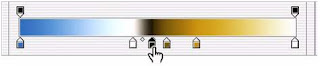
Select Gradient Overlay. Click on the gradient to bring up the Gradient Editor. Choose the gradient type that looks like the reflections used in metallic type.
When you choose a particular gradient it appears in the Editor box. You can now adjust the gradient in any way you want. Clicking the paint wells below the gradient allows you to move their position or change their color in the settings area. Clicking below the gradient where there is no well will automatically insert a new well. The wells along the top of the gradient control opacity.

10.Adjust the angle.
Once you have the gradient you want, click OK to exit the Editor. Back in the Layer Style dialog, adjust the Angle so the gradient intersects the logo at the right angle to simulate the reflections in the metal.
11.Add Stroke.
Finally, choose Stroke to add an edge to the logo. Click OK to exit the Layer Styles dialog.
0 comments:
Post a Comment